Originally posted on Iridescent Exhibition Facebook.

Tell us about yourself:
My name is Hannah Else Antonsen, I grew up in Shellharbour, NSW and moved to lovely Canberra in 2011 for this degree. I’ve also have been spending a few months living in Jindabyne during the snow season each year. My passions are web, digital design, data visualisation, and anything designy really..
What do you love most about design?
I obsess over web design. I’ve pretty much taught myself (when I say that, I mean Google taught me) and I find it such a rewarding experience. Nothing feels better than taking on a challenge I’ve no idea how to accomplish and after a lot of trial and error I’ve created something cool. There’s always more to learn, and I never want to stop developing my knowledge.
Who inspires you?
Nicholas Felton, seriously, when his annual report comes out it’s like Christmas for me. I would love to take on a massive self-initiated (and self-serving) design task like he does! And of course, his work on the Facebook Timeline, which is something I (regrettably) enjoy on a daily basis.
Your life goals?
Live in a tree house, inspire others, live life, and do no evil.
What do you want to do after uni?
Get some sleep, go on an adventure, and keep learning.
What have you been working on lately?
Too much! Recently, I built the website for our exhibition, made a plasticine children’s book about Canberra, have been running Daily Designer and some other things. Over winter I built the website for the UC Communications Ball whilst working as a photographer at Perisher.
Tell us about your featured piece:
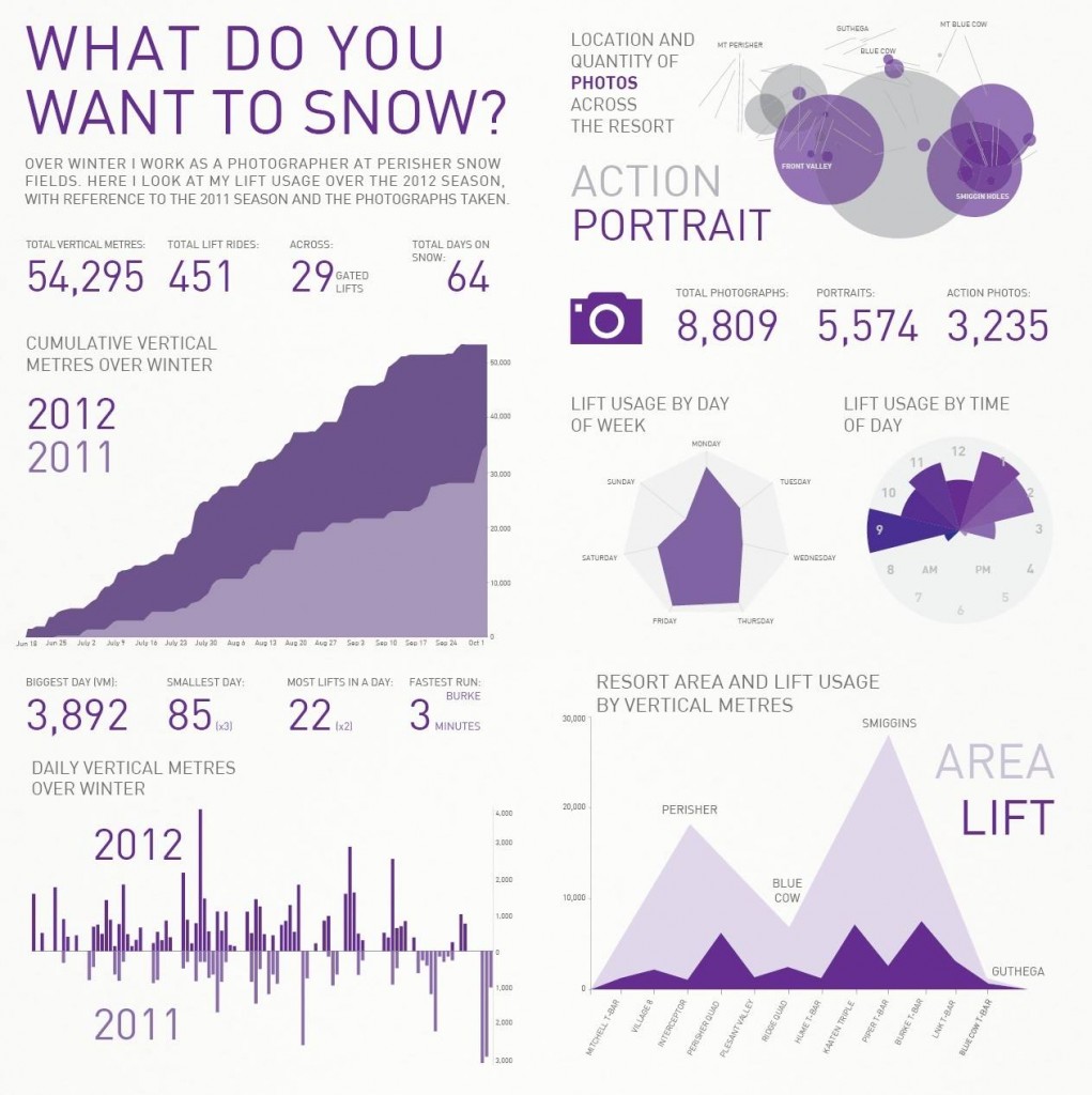
‘What Do You Want to Snow?’ (Great title, I know) is my own mini version of Feltron’s annual report; my seasonal report. An Infographic about my 2012 and 2011 snow seasons visualising data from my lift use as well as a bit on my work as a photographer. Currently Perisher offers guests a website with their lift stats, featuring pie charts and line graphs. I wanted to see what I could do with all this data including the height, times, distance and location and so I developed this series of graphs which display this information in various ways. I will definitely be doing another one of these with my data from this year; once I have a spare moment.
Where can we find more of your work?
On my brand new portfolio website:
www.elssan.com
and on Twitter @ElssanDesign
iridescent2013.com/hannah