Originally Posted on New Web Contexts 2014. The following is my proposal for New Web Contexts project where we were able to research and develop an innovative design proposal for a specific physical and cultural context. My group members, Johanna and Matt, and I will develop this project over winter.
An Experience of Light
An Experience of Light aims to blur the lines between art and web design; between the physical world and the digital world. The project will be based around a current exhibition at the National Library of Australia; Luminous World, contemporary art from the Westfarmers Collection which are an exploration of light. And takes inspiration from renowned visual artist Olafur Eliasson who works a great deal with light and spaces and relationship between these and the viewer, as well as looking at existing interactive systems used by galleries, such as the Cleveland Museum of Art.
LUMINOUS WORLD
“The visual world is defined by light: everything we see is processed by the eyes as patterns of brightness and colour.”
The Luminous World exhibition explores how contemporary artists utilise the phenomenon of light, across a variety of mediums, styles and cultural contexts. The exhibition loosely follows through the journey from night to day. Light is explored from the perspective of the optical experience, with references to the movements of the stars, as well as the cultural, spiritual and mythical concepts which light is associated with. The collection reveals the power of light in defining and transforming our world, and viewers are able to consider this power once engaged with the intimacy of the works.
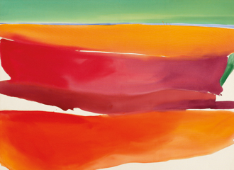
Examples of the work: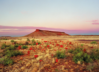
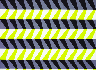
Rosemary Laing “Brumby mound #5” from the series One dozen unnatural disasters in the landscape 2003
OLAFUR ELIASSON
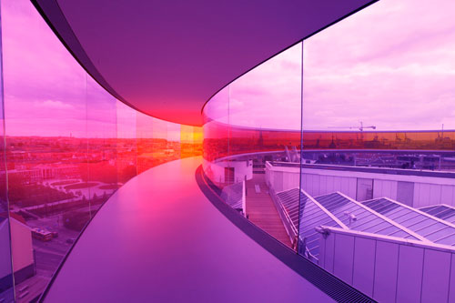
The exploration of light and it’s effects in the Luminous World exhibition brings to mind Danish-Icelandic artist, Olafur Eliasson, known for creating works which employ elemental materials, such as light, to enhance the viewer’s experience. His 2009 TED talk about space and light, Eliasson discusses the importance of the space, and being in a space, an interesting idea to consider when working with the web in a context; how to engage the users of a digital product in the physical space.
“Having an experience is taking part in the world. Taking part in the world is really about sharing responsibility”
BEAUTY
In 1993 Eliasson took inspiration from a theatre stage technique of an illuminated steady mist of water falling, to create his work Beauty. He makes an artificial rainbow as the light breaks in the water of the mist. The piece featuring falling water is affected by time, so that everyone will see a different rainbow, in that moment, off that water droplet, from their view. Visitors to the space are able to interact with the piece, walking through the wall of light, as if it didn’t exist, removing the barriers of the physical.
THE IDEA
I propose we engage the audience of Luminous World in the exhibition, through a web app that encourages the interaction with the space through light, as seen in the works of Olafur Eliasson.
Visitors to the exhibition use either provided iPads, or their own mobile devices, to access the web app. The access will either be through a local area network or entry is dependent on the user’s location, to ensure only people in the space are able to use the system. The web app has access to the device’s camera, as visitors are able to take photos of the works that interest them, interpreting the light through the digital technology. The system will be able to recognise what piece the user has photographed, and then provides more in-depth information about that work and the artist.
These photos taken throughout the exhibition are held on the site temporarily, and when the user gets to the end of the exhibition they enter a new space, a small dark room with just a curtain of water mist falling, like Eliasson’s Beauty. In this space users are able to upload the photos of the exhibition they captured, which are projected as light onto the water like a kind of simple projection mapping.
The experience would blur the boundaries between the physical work, the digital space, and the viewer. Visitors are able to interact with the exhibition, present their own view and then have the experience of moving through the light that they captured, without a physical barrier.
THE HOW
Projecting onto mist has become quite popular for entrainment value since Eliasson created Beauty in the early 90s. There are many companies which produce large-scale products with motion graphics and light displays for events. There are also a number of companies which sell the screens, such as FogScreen, but, depending on how handy we are, we could possibly produce something similar with some filters, hoses, filters and a projector.
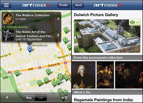
The app would have to recognise the photos users take of the works with image recognition software. There are many of such softwares which exist, like the Artfinder app from the Dulwich Picture Gallery, which was originally developed to allow visitors to the gallery to scan the paintings with their phones. The collection in the exhibition is rather small, so it shouldn’t be too hard to have the system differentiate each piece.
Another, more in depth app for exploring a galleries collection is the ArtLens by the Cleveland Museum of Art. This innovative system works on a tablet or phone, and with the 40ft multi-touch screen the gallery boasts. The app features image recognition, indoor wayfinding, updates on current events, search, ability to save favourites and to make your own tours, view the most popular, the gallery lists and see relationships between artworks.
The web app developed for Luminous Worlds would be much simpler, giving the users the ability to discover more about the works from the photos, and then upload their photos from their time in the gallery to the projection.
THE WEB
This project would utilise web technology as a way to interact with the physical space and remove the work from it. We could consider the significance that the majority of web design relies on light to communicate. An artificial light produced to suit our needs, whereas, the majority of work in the exhibition explores natural light. This conflict between the man-made and the natural is reflected in the projection space, as we harness the elements of water and light to create something unnatural.
THE SPACE
The National Library is a very spacious place, but the gallery spaces are used effectively, leaving little room for additions. It would be necessary to alter the space in order for the projection to work, as we’d need a dark room where we can run the mist and projector. Space for this within the gallery is very limited, with the possible exception of a small hall as you exit the exhibition. But there are possibilities for creating this temporary structure just outside the entrance to the gallery and outside that, in the lounge area, there is even more room, and would pique the interest of the general library visitors.
THE FLEETING
The nature of the web app is that it is completely temporary. Users are unable to save the images that they have taken (protecting the artist’s rights), these are wiped at the end of the experience, ready for the next user to start fresh. The whole experience is fleeting, just like light is in time. One can never truly capture light, only represent and interpret it, and so visitors have the opportunity, like the artists featured in the exhibition, to express their view of light by taking photos and then view it as only light, before it is gone forever. The experience leaves only the memory, and nothing to take away, which is unlike a lot of the way our technology works these days.
FINALLY
I feel a project which explores the role of a digital product in a physical space and enables engagement with, and consideration of, the meaning of the work and the nature of light is an interesting task for the group to investigate. There is potential to create a completely new experience for many people, and bring innovation and interactivity to an otherwise ordinary exhibition.

