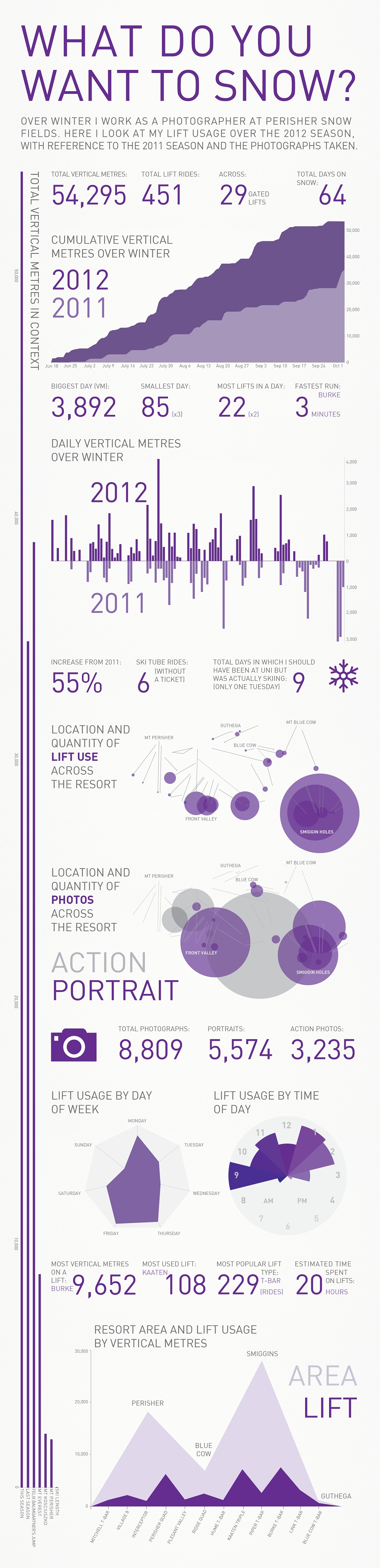
'What Do You Want to Snow?' is my own mini version of Feltron's annual report; my seasonal report. An Info Graphic about my 2012 and 2011 snow seasons visualising data from my lift use as well as a bit on my work as a photographer.
Currently Perisher offers guests a website with their lift stats, featuring pie charts and line graphs. I wanted to see what I could do with all this data including the height, times, distance and location and so I developed this series of graphs which display this information in various ways.